Research
My first approach to analyzing layout design was to research existing design. I decided to study how web design had evolved over the past twenty years, so I wrote a simple bot that crawled the Internet Archive’s WayBack Machine and generated sequential screenshots of any given website. Using these image sequences as individual frames, I created short stop-motion films of web history.
Unfortunately, since older browsers varied significantly from each other, many web developers resorted to only supporting a single browser and used non-standard, vendor-specific code. This hiccup in web development meant that many of the archive’s snapshots from the early 2000s could not be rendered correctly in a 2014 version of webkit.
Explore this way on your own – get the bot on GitLab →
These films are intriguing. They are representative of so many things: of screen sizes, web standards, proprietary format wars, vendor-specific features, visual trends, industry changes and more. Significant layout changes are visible and on some of the less active films they are actually very apparent. However, the fluctuant content of most websites makes it difficult to examine them closely.
In order to see these sites’ layouts in a broader, brighter light I needed to simplify the image sequences. Referencing low fidelity wireframes, I outlined several screenshots with simple shapes and lines to test readability. Going from the minimum up, I took note that block-level shapes weren’t descriptive enough to determine the functionality of a site, but adding too many elements that represented more ornamentation than content brought me back to the previous issue of density. I ultimately decided to fill in all advertising spaces, large images and certain interactable elements with solid colors and to only show lines representing text as headlines, navigation, or similarly emphasized content.
Now that I had a consistent method to discern structural basics from finished products I could start looking more deeply into specific samples. I drew upon my stop-motion films to look for sites across a theme and with large and generally usable archives. It was important that the sites I chose be similar to each other so that I would later be able to make cross-sectional examinations and determine trends reliably.
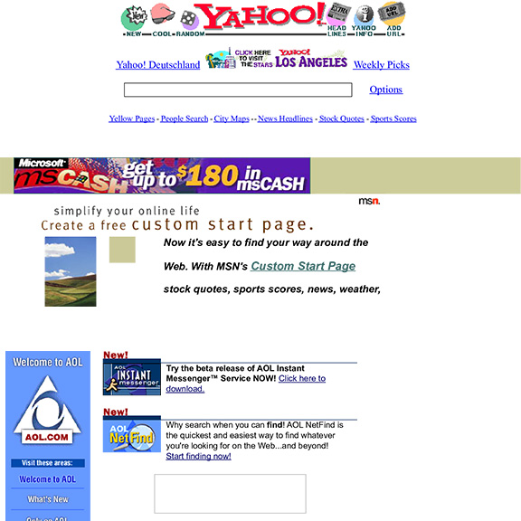
I found three sites each with close to twenty years’ worth of archives in the WayBack Machine and all in the same field. It is also noteworthy that AOL, MSN and Yahoo have been heavily invested in over that period of time, ensuring that each update to the site would have been an honest attempt at driving usability and ultimately revenue. The final driving point to choose these three was their prominence in web history.
AOL is well known for its past as an internet service provider as well as its now-infamous browser (the remnants of Netscape, too). MSN has been an international news source and over time has gained and lost integration with various other Microsoft products, as well as being the default homepage in Internet Explorer, and finally Yahoo, with its early search engine and over half-billion monthly users today, is another internationally known brand.
I started investigating these news media through the identification of site redesigns. By isolating these I could pin down the most active periods of web design and track specific points across other factors, such as the most common screen dimensions and wider gamut color support at the time.
By looking at every redesign, it’s clear to see that site updates have gotten less frequent as of late. This is an indicator of the changing approach to web design; from small, incremental, public tweaks to behind-the-doors full overhauls (at least visually) with great days of unveiling. There’s much to be said about the benefits of the former method. Namely, it is likely the biggest contributor to the savviness of the average adult web user today. Developers, designers and users alike all learned how to organize and navigate digital content together as needs and wants grew and they were able to build upon simple interaction techniques one small step at a time; a process which has now led to complex web apps without the expense of reading a tutorial to check your news feed. Users today are expected to know how the web works and are seldom offered help with complicated applications or roundabout interaction flows.
If we narrow the selection down, however, we can find that there are about five major redesigning points in each of these sites’ archives. In order to help illustrate my research, I decided to use these samples as keyframes for a series of animations showing how layouts have changed over time.
Creating the animations
Watch the animations: AOL, MSN and Yahoo.
In order to be accurate in as many aspects of my animations as possible, I looked up the most common screen sizes over the past twenty years. A survey by the Nielsen Norman Group was an immediate resource and gave a good generalization of the upward trend in screen dimensions. Among other agreeing sources was Statcounter, showing more detailed statistics from 2009 onward. Using a slight combination of these sources to get a wider range of data, I picked out the largest prevalent monitor size around each of my five samples.
In efforts to find suitable audio to accompany the animations, I searched high and low for what I thought would be appropriate (and royalty-free) music. Ultimately, I both felt and was advised to record my own music. Using a pair of mics and a combination of audio software, I decided to record Robert Muczynski’s “Gallery” suite for unaccompanied cello. The pieces within vary naturally, but have of an earnest and jaunty vibe that pairs well with my visual approach.
Before investing too much time on theory alone, I made a series of test animations to explore different visual and animation treatments. Luckily, I found my former conclusion to convey these sites’ histories in an accurate and unobtrusive way and so I set to work creating a more extensive test subject with a full audio track.
Dubbed this project’s “trailer,” it shows a little bit of each site I’m featuring and proves that even with more somber music that the animations could be successful.
Recording the music
After creating the trailer, I sought after livelier and possibly more relevant music to animate my case studies to. Among those considered were bands like Air, Ratatat, Wax Tailor, RJD2, and Tycho. Although some tracks I reviewed seemed promising, I couldn’t find any firm reason that these would produce a good, valid choice.
Looking back to the trailer, I realized there were more flexible and diverse opportunities within the narrower scope of classical. In the end, I came across a Polish-American’s jaunty suite for cello which seemed to fill in where my trailer had been lacking, without the heavy burden of literal reference (or rights and royalties) posed by using more contemporary music.
I chose to record my own performances of several pieces from Robert Muczynski’s 1966 “Gallery” suite for unaccompanied cello. I used a wide diaphragm condenser microphone as a room mic and a piezoelectric transducer to directly capture the fuller tones of my cello. Both microphones were fed through an external audio interface panned to stereo and through that to my digital audio workstation.
View all of my gear here →
Due to the time constraints of this project and delays in acquiring certain gear, I only had one week to rehearse and two weeks to further rehearse, record and master all of my audio in order to make my animation deadlines. Under this tight restriction, I was unable to secure an acoustically designed hall for recording and had to skimp on getting the amp I wanted to use with the contact mic. Making do with the rest of my resources, I set up a home studio and got practicing as soon as the sheet music hit my doorstep.
I recorded in a large, open room with my personal cello. After significant testing to assure the absence of any standing-wave producing walls or objects, I tested the room’s reverberation aurally by listening to a fixed recording from various points in the room. Based on my observations, I then recorded samples from where I thought it would be best to position the room mic and later used the cleanest location to record the pieces. I used Adobe Audition to record and mixed the final tracks in Ableton Live 9.
In mastering the recordings, I wanted to preserve the clean staccato feel of the pieces “Shanty” and “Black Iron” without losing the soft, sustained slurs of “Noonday Heat.” I ran each recording’s room mic through an initial compressor to match the volume level of the contact mic, which in turn was fed into a digital amp tuned to produce a bright and natural sound. The contact mic also primarily fed a reverb effect return track to softly fill in frequency gaps where my room didn’t reverberate effectively. A second return track was used to crossfade the left and right channels to produce a more equally distributed input for the master track, which is where I lightly equalized frequency levels before compressing and limiting the audio to produce broadcast-ready tracks.
Creating the website
I created this website from scratch in order to present my project in its native medium and most directly to its audience. This website uses modern (2015) web standards and was developed for equally modern browsers.
Before starting on the visual design, I inventoried my content and made a hierarchy tree to map out all the information I needed to organize and display. I then combined and translated those nodes to create a sitemap and ultimately from that a visual styleguide and example page mockup. After numerous iterations and a lackluster attempted v1.0 release, I completed the frame of this Jekyll-driven site and was then able to import my content.
Adding writing first, then images and finally video, I made tweaks along the way to support and unify various elements like definition lists and deeper heading levels. The site is now hosted by GitLab Pages directly from its remote repository.
View the source code on GitLab →